How To Use Colour In A Small Room
A practical step-by-step guide to how to use colour in a small room, including preparation, instructions, common issues, tips, and next steps.
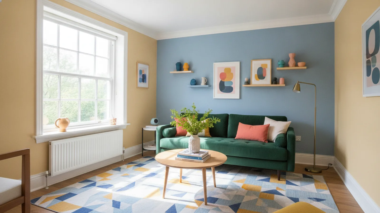
How To Use Colour In A Small Room
This guide explains how to approach how to use colour in a small room, including the preparation, practical steps, common mistakes, and final checks that help you finish with confidence.
Before You Start
What You Need
Safety, Timing, or Context Checks
Step-by-Step Instructions
Quick Reference
Common Problems When You Use Colour In A Small Room
Problem: The room still feels small and dark.
Fix: This is usually caused by choosing colours that are too dark or too warm, which tend to absorb light rather than reflect it. Re-evaluate your main wall colour. Consider switching to a very pale cool neutral, such as an off-white with a hint of blue or grey, or a very light pastel. Also, check if you have enough artificial lighting; sometimes, even the best colour choices need good lighting to shine. Add more lamps or increase the wattage of your bulbs. Ensure windows aren't overly obscured by heavy drapes; opt for lighter, sheerer options if possible.
Problem: The chosen colour looks different on the wall than on the swatch.
Fix: This is a very common issue. Paint swatches are tiny, and colours react strongly to the unique lighting conditions of your room. Always buy sample pots and paint large squares (at least A4 size) directly onto your walls. Observe these samples throughout the day, as natural light changes, and in the evening under artificial light. The colour might have subtle undertones (e.g., yellow, pink, green) that become more apparent in certain lights. If it's too late and you've already painted, consider if a different finish (e.g., matte vs. eggshell) might alter the light reflection slightly, or plan to repaint with a more suitable shade after extensive testing.
Problem: The room feels too busy or cluttered.
Fix: This often happens when too many different colours, patterns, or styles are introduced into a small space. Simplify your colour palette. Stick to a maximum of two main colours and one accent colour for the entire room, including furnishings and accessories. If using patterns, choose one dominant pattern and keep others subtle or textural. Remove unnecessary decorative items that contribute to visual noise. Remember, less is often more in a small room.
Problem: The new wall colour doesn't match existing furniture or flooring.
Fix: It's crucial to consider all existing elements when planning your colour scheme. If you've already painted and there's a clash, you have a few options. If the furniture is small, consider slipcovers or throws in a complementary colour. For larger pieces, or if the flooring is clashing, you might need to adjust your wall colour to better harmonise. Take photos of your furniture and flooring when selecting paint swatches to ensure they work together. Sometimes, adding a rug that ties the wall and floor colours together can also help bridge the gap.
Problem: The room feels cold or uninviting with light colours.
Fix: While light, cool colours often make a room feel bigger, they can sometimes lack warmth. If your room feels too sterile, introduce warmth through textures and materials rather than adding more colour. Think about incorporating soft textiles like wool throws, linen curtains, or natural wood elements. You can also add very subtle warm accents with accessories, such as a few golden picture frames or cream-coloured cushions. Consider paint colours with slightly warmer undertones, such as a soft off-white with a hint of cream or beige, which still reflects light but has a more inviting feel.
Advanced Tips for How To Use Colour In A Small Room
Tip 1: Explore "Colour Drenching" for a Cocooning Effect
While often discouraged for small rooms, a technique called "colour drenching" can be highly effective in very compact or awkwardly shaped spaces. This involves painting not just the walls but also the ceiling, trim, and sometimes even built-in furniture all in the same single, deep colour. Instead of trying to make the room feel bigger, this approach creates an intentional, immersive, and cosy "cocooning" effect. It blurs the boundaries of the room, making it harder to perceive where walls end and ceilings begin, which can paradoxically make the room feel less restrictive and more intentional. Choose a rich, muted shade for the best results.
Tip 2: Use Vertical Stripes or Panelling to Add Perceived Height
If your small room feels low, consider adding vertical elements to draw the eye upwards. This can be achieved with carefully chosen wallpaper featuring subtle vertical stripes, or by installing decorative wall panelling (like dado rails or full wall panelling) and painting the sections in slightly different, complementary shades or tones of the same colour. The vertical lines create an illusion of height, making the ceiling appear further away. Ensure the stripes aren't too bold or numerous, as this can make the room feel busy; subtle patterns work best.
Tip 3: Zone Open-Plan Small Spaces with Colour
For open-plan areas where a small "room" is part of a larger space, use colour to define specific zones without building walls. For instance, paint the walls of a small dining nook a slightly different (but harmonising) shade than the adjacent living area. This visually separates the functions of the space, making each area feel distinct and purposeful, even if it's physically small. Use rugs and furniture placement to further reinforce these colour-defined zones. Maintain a consistent overall palette to ensure flow.
Tip 4: Leverage High-Gloss Finishes for Strategic Light Reflection
Beyond walls, the finish of your paint can significantly impact a small room. High-gloss paint on specific features like doors, window frames, or even a single piece of furniture can create intense reflections, bouncing light around the room. This effect is particularly striking in a room with a predominantly matte finish on the walls. The contrast in textures and the added reflectivity contribute to a brighter, more dynamic space. Use sparingly to avoid an overly clinical feel; a little gloss goes a long way.
Tip 5: Consider Light Reflectance Value (LRV)
When selecting paint, look for its Light Reflectance Value (LRV), often found on paint swatches or manufacturer websites. LRV is a number that indicates how much visible light a paint colour reflects or absorbs. A higher LRV (closer to 100) means the colour reflects more light, while a lower LRV (closer to 0) means it absorbs more. For small rooms, aim for paints with a high LRV (typically 60-80+) for main wall colours to maximise light and space. This scientific approach ensures your colour choice is truly working to make the room feel larger and brighter.
How To Use Colour In A Small Room FAQ
Q: Can I use dark colours in a small room?
A: Yes, but with caution and strategy. While light colours generally make a room feel larger, a single dark accent wall can add depth and drama without shrinking the space. Alternatively, "colour drenching" (painting all walls, ceiling, and trim in a single deep, muted colour) can create a cosy, intentional "cocooning" effect in a very small room, blurring boundaries rather than trying to expand them. It's about choosing the right dark shade and balancing it with plenty of light-reflecting elements like mirrors and good lighting.
Q: What's the best colour for a small bedroom?
A: For a small bedroom, calming, light, and cool colours are often best. Think soft greys, pale blues, light greens, or serene off-whites. These shades promote relaxation and make the space feel tranquil and expansive. Avoid overly bright or stimulating colours, which can disrupt sleep. You can always introduce warmth or personality through bedding, cushions, and artwork.
Q: Should I paint the ceiling lighter or darker than the walls?
A: For a small room, it's almost always recommended to paint the ceiling lighter than the walls, typically a crisp white or a very pale tint of your wall colour. A lighter ceiling will draw the eye upwards, making the room feel taller and more open. Painting the ceiling a darker colour can make it feel lower and more oppressive, which is generally not desirable in a small space, unless intentionally trying to create a very intimate, dark cocooning effect.
Q: How many colours can I use in a small room?
A: To avoid making a small room feel cluttered or busy, it's best to stick to a limited colour palette. Generally, aim for two main colours and one accent colour. For example, a light neutral for the walls, a slightly deeper tone from the same family for key furniture, and a single vibrant colour for small accessories. Too many colours can visually chop up the space and make it feel even smaller.
Q: Do cool colours or warm colours make a room look bigger?
A: Generally, cool colours (like blues, greens, and purples) tend to recede visually, making walls appear further away and thus making a room look bigger. Light, cool colours are particularly effective. Warm colours (like reds, oranges, and yellows) tend to advance, making walls feel closer and the room feel cosier, which can sometimes make a small room feel even more enclosed. However, very pale warm neutrals can still work well if they reflect enough light.
Q: Can textured wallpaper work in a small room?
A: Yes, textured wallpaper can work in a small room, especially if it's on an accent wall or has a very subtle pattern. Textures add depth and interest without adding extra colour. Look for wallpapers with subtle vertical patterns or those that mimic natural materials like linen or grasscloth. Avoid large, bold, or overly busy patterns, as these can overwhelm a small space and make it feel smaller.